What do you think about the combination of old and new elements in RE: VERO CASA? Do you feel the touch of Tuscany in the design?
RE: VERO CASA
Architect: REFORM Architekt Marcin Tomaszewski
Location: Poland
Project Year: 2022
Category: Private Houses
A subtle whiff of Tuscany, a perfect blend of old and new, and a sophisticated composition. RE: VERO CASA by REFORM Architect.
Is it possible to make an old house even older, and next to it add a new one - modern in its form, combine them together and still keep the classic Italian flair? For REFORM Architekt, nothing is impossible. In this project there was no room for artificiality and appearances. Corten, wood, concrete - all the materials used are authentic and real! RE: VERO CASA is in a word - Italian emotions Made in Poland!
Under the sun of Tuscany
Often, what a house design should look like is a result of what its surroundings are like. It is also about the authenticity of the place. Marcin Tomaszewski cares very much about this. He doesn't feel the need to change "by force" if he sees that the place has potential, and the already existing building on it - its history.
When the architect arrived at the site of the new project he did not find an empty plot of land there. There was already a house there, inhabited by the current investors. Very characteristic of construction from 20 years ago. This could be recognized, among other things, by the layout and two turrets. This provoked in the architect's mind the thought that this house had an atmosphere like the one he saw in Tuscany. He didn't want to lose it, and in fact it turned out that this would be the leitmotif of the entire project.
‘In this project, I was very interested in enhancing the Italian style, with the investors needing more space. I couldn't imagine tearing down this old house. I decided to age this existing block and designed a completely new one for it’ says architect Marcin Tomaszewski. ‘The skillful combination of the two resulted in a coherent design. Interesting, and above all, looking at the whole - you can feel a whiff of Tuscany here’ he adds.
The entrance to the house is possible through the new part, while already from the front you can see practically the whole block. The house is U-shaped, so the functions are distributed accordingly - so that they intermingle. It is worth noting that on the site the architect and the investors have preserved old plantings, including trees.
Authenticity of materials and details
When we go to the back of the house - on the garden side we see how one block is set back, relative to the other and the latter forms a kind of clasp, which is certainly influenced by the designed facade.
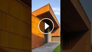
‘In this project there was no room for artificiality and appearances. Corten, wood, concrete - all the materials used are authentic and real! That's why the facade blends so well with the surroundings’ says Tomaszewski.
It is worth noting that the architect also made sure that nothing was wasted in terms of materials. When the turrets were eliminated - the tiles from them were used to finish the new roof. This avoided the problem - where to get the material that was used several years ago.
Investors also willingly put in the hands of Marcin Tomaszewski advice in terms of interior design. As a result, we can see a reproduction of Guernica by Pablo Picasso in the study. It blended perfectly into the space. And the choice was not accidental - it is one of the Spanish artist's favorite paintings and this can be evidenced by... the tattoo that adorns Tomaszewski's hand. And just as the architect stuck to authenticity with regard to materials on the outside, he was also consistent on the inside. An example? The dining room table is 100% wood.
There is also a curiosity associated with this house... This is the only house in Tomaszewski's career where during the construction of the modern block - the owners lived in the "old" part. Later there was a swap and they moved to the new one while the old one was being renovated. Everything was planned and prepared in such a way that the residents did not feel the renovation, which took more than 1.5 years. Today, the part of the house that used to serve a function - living and bedroom - is a place of relaxation - with a modern spa and gym.
Team:
Architects: REFORM
Photographer: Piotr Krajewski
#architecture #interiordesign #contemporarydesign #homedecor #homegoals #housegoals
#TuscanyVibes #ItalianArchitecture #ModernDesign #OldandNew #CortenSteel #WoodenElements #ConcreteDesign #AuthenticMaterials #PolishArchitecture #EmotionsInDesign #ItalianStyle #ClassicFlair #RealEstateDesign #DreamHome #ArchitecturalWonders #DesignInspiration #PolandArchitecture #CoherentDesign #SophisticatedComposition #ItalianEmotions #MadeInPoland #TuscanSun #AgingDesign #AuthenticityMatters #BlendOfStyles #WhiffOfTuscany #HistoryAndModernity #ArchitecturalBeauty #PolishHomes #HomeDesign #HouseInspiration #DesignGoals #LivingSpaces
- Catégories
- Architecte
- Mots-clés
- architecture, interiordesign, homedecor





Commentaires